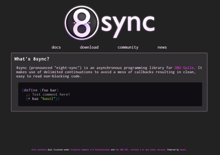
8sync site WIP

I don't consider myself a "graphic designer", but I think this new 8sync site design is going pretty great.
I'm using Haunt by @David Thompson which is an absolute delight to hack in.
wilo, j1mc, Matt Molyneaux, David Thompson and 3 others likes this.
I'd give the logo less air above and more air under it. Otherwise nice and clean so far
mray INACTIVE at 2016-04-04T18:58:16Z
Christine Lemmer-Webber likes this.
Ooh, that looks good!
Let me know if you'd like any CSS / design help on this. :)
Let me know if you'd like any CSS / design help on this. :)
Sean Tilley at 2016-04-04T19:31:49Z
Christine Lemmer-Webber likes this.