
全球疫情的數字,我比較常到 Our World in Data 計畫的疫情專頁查看。Our World in Data 是 Max Roser 於 2012 年在牛津大學當博士後時發起的專案,目前團隊大概九個人,有受到 Bill and Melinda Gates Foundation 的贊助。計畫的精神就用網站上這段話說吧:
"Our World in Data is created as a public good. All data is available for download. All visualisations are Creative Commons licensed. And all the tools we build are entirely open source."
我承認這個有打中我。這計畫的疫情網頁 "Coronavirus Disease (COVID-19) – Statistics and Research" 在這:
https://ourworldindata.org/coronavirus
這網頁每日更新一次,資料來自 European Center for Disease Control and Prevention (ECDC)。不用 WHO 的數字,這計畫說得很明白:錯誤很多,還不更正。ECDC 的資料涵蓋全球的國家(當然包括科索沃、巴勒斯坦、以及台灣),以及之前在日本的一艘國際運輸器 (International conveyance in Japan)。看到這裡,是不是覺得很爽?
這網頁不只是簡單的數字加總跟圖表。上面還有,舉例來說,「確診死亡數要多少天才加倍」(How long did it take for the number of total confirmed deaths to double?),可按照國家查詢。目前重災區中,義大利每 4 天死亡人數倍增,西班牙每 3 天倍增,法國每 4 天倍增,美國每 3 天倍增,英國每 4 天倍增,等等。中國,嗯,每 38 天倍增。
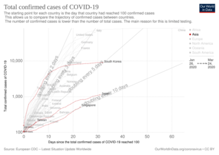
「第 100 例確診之後軌跡圖」(Trajectories since the 100th confirmed case) 則呈現各地區(各國)的確診數在第 100 例之後的走勢。歐美重災區過去每 3 天倍增。新加坡、日本是每 10 天倍增,台灣這一陣子每 5 天倍增(但才過 100 例不久)。韓國初期聲勢驚人,每 2 天倍增,不過目前壓到每 5 天倍增(韓國已有近 10000 例)。如圖。
研究工作嘛,濃茶咖啡免不了。這幾天為了看線圖,每天加喝一罐可口可樂!