
Warn users when posting to... no one
JanKusanagi at
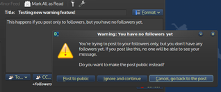
I've added a little warning in Dianara that will pop up when a user tries to post a message only to "Followers", if they have no followers.
If this is allowed, that message will be basically seen by no one. To try to prevent frustration for new users, I've added this little warning with a button to post to Public instead (so the message might be seen by people on the Firehose, people checking out their profiles, etc).
I could make public posting the default in Dianara, but I think this is safer. There's obviously a setting in the Configuration dialog to make "public posting" the default, at the user's discretion.
The wording and the texts on those buttons still need some refinement. I might remove the middle button, since it doesn't make much sense, but then it wouldn't be possible to post to an empty Followers list, which someone might want to do for tests or something.
What do you think?
Justin Pyvis, John Hume, EVAnaRkISTO, lnxwalt@microca.st and 4 others likes this.
Doug Whitfield shared this.
A good idea. I didn't even know that I should choose who to post to when I first got to pump.io.
As for the text on buttons. Given that you actually ask a question in the box, why not label the buttons with answers? E.g. "Yes, post to the public", "No, post to nobody", "No, let me change this" or whatever. It just feels better to me.
BTW, I believe I got the idea from "The Humane Interface" by J. Raskin which is worth reading when you design ux. But note, he's got some arguable concepts there, too.
>> dvn:
“E.g. "Yes, post to the public", "No, post to nobody", "No, let me change this" or whatever. It just feels better to me.”
Those sound pretty good. That's the kind of thing I meant by "need some refinement".
Thanks for the suggestions =)
That's a great idea!